Services: | Dashboarding |
Description: This is a custom greenhouse gas dashboard using Microsoft Excel. It uses real-world data, research statistics, and custom excel designing. Please explore it at your leisure. References are on the dashboard.
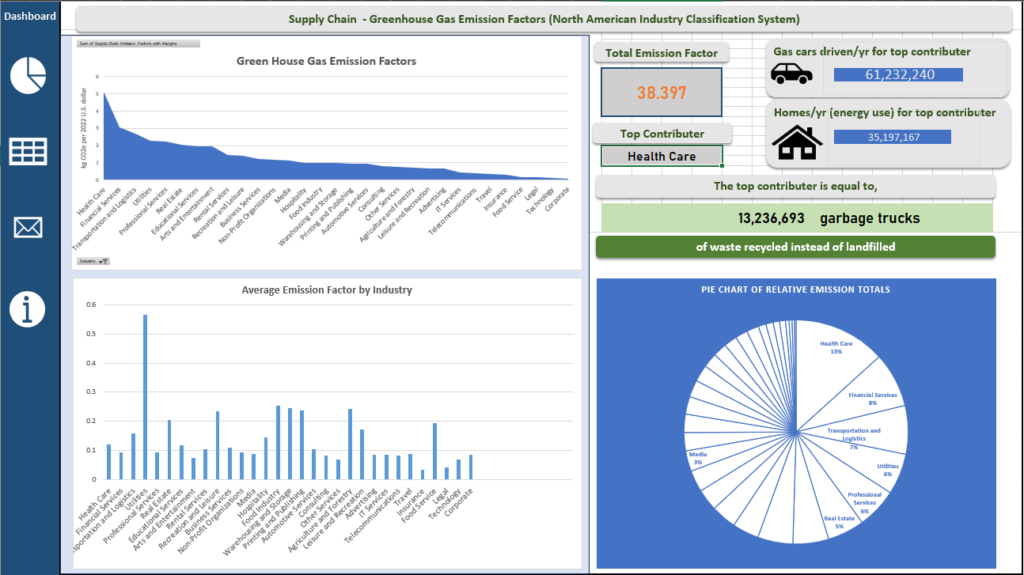
Background: The total emission factor for greenhouse gases quantifies the average emissions produced per unit of activity. This data uses “million metric tons of CO₂ equivalent” as the measure that would equal one unit of activity. As noted from the CDC, “a million metric tons equals about 2.2 billion pounds, or 1 trillion grams. For comparison, a small car is likely to weigh a little more than 1 metric ton. Thus, a million metric tons are roughly the same mass as 1 million small cars.” This allows industries to estimate their greenhouse gas emissions accurately by multiplying the emission factor by the amount of activity conducted or dividing it by a measurement of gas emissions that equates to a unit of activity.
Dashboard Info: The top contributor is shown for the selected industries (from the filter). As an aside, don’t mind the misspelled “Contributor” word in the dashboard. The gas cars driven/yr for top contributor and homes/yr (energy use) for top contributor reference how much total numbers of those cars or homes would respectively account for the amount of emissions released from the industries selected. They are mutually exclusive. That means it’s not the case where 61.2 million cars and 35.2 million homes equate to the total emission factor. As shown in the picture (below), since all the industries are selected by default, 61.2 millions cars are the equivalent of a total emission factor of 38.397. Likewise, 35.2 million homes are equal to the same emission output individually.
Interactivity:
1). The icons on the left of the dashboard should direct you to specific areas of the workbook. They are your navigation between different pieces of the dashboard.
2). Currently the data is not filtering any of the industries. To do so, click the small grey filter button on the lower left hand side of the top-left chart. Select the industries of your choice and click “Ok.” This will automatically change the data according to the filtered industries.
3). As the data is changed on the “Dashboard” worksheet tab, the “Input” worksheet tab will be filtered accordingly. This is because the data is be pulled from this to create the interactive charts!
Please download at:
https://realizec3d.com/wp-content/uploads/2026/01/GHGExcelDashboard.xlsx